In 2023 you, as a business owner, should know it’s no longer enough to have a static website design that looks super good on the computer screen. Mobile devices, including tablets and laptops, rule the customers’ market. Thus, customer experience should be equally eye-catching on all screen dimensions when it comes to modern design.
So, let’s talk about design that makes your website look its best on all devices, about the ‘mobile-first’ concept, and find out some practical tips on how to stay competitive in terms of design in years to come.
We have consulted one of our design experts, Kirill Khimenko, and prepared a practical guide to mobile-first responsive design.
Why Does Mobile-First Design Matter?
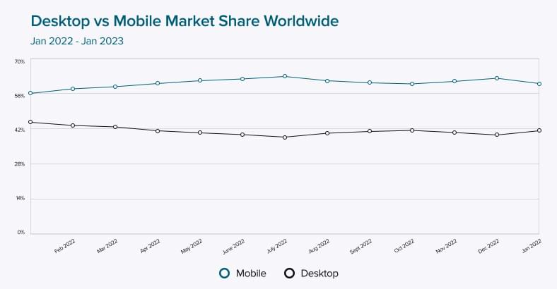
For starters, recent statistics for mobile and desktop share worldwide are below. As we can see, mobile usage prevails over desktop with 61% against 38% during the previous year alone. And this tendency is predicted to grow.
Desktop vs. Mobile Market Share Worldwide
In addition to this statistics dominance, let’s also find a few more reasons to consider mobile-first design for your website:
- Improved user experience
- Greater accessibility
- Better website performance
- Improved scalability
- Better indexing in Google
We should also mention that Google primarily uses the mobile version of a website’s content for indexing and ranking. It is mobile-first indexing, so when you start your project, we recommend going mobile. Mobile-first indexing is enabled by default if your website was published after July 1, 2019.
Here is a little recap: Google’s crawling, indexing, and ranking systems typically used the desktop version of a page’s content, which may have been causing issues for mobile searchers when that version vastly differed from the mobile version. Mobile-first indexing means that Google will now use the page’s mobile version for indexing and ranking to help better their – primarily mobile – users find what they’re looking for.
Read also: Mobile app development trends in 2023 and their benefits for business
Mobile-first index is no longer a “hot” topic but rather a part of our daily life experience. Since the announcement of the mobile-first index, Google has now also emphasized the Page Experience, which is a ranking factor and very much covers mobile.
The theoretical part is almost over, so let’s move to the practical one.
Adaptive vs. Responsive Design
When it comes to website design, our designers use two main approaches: responsive and adaptive.
Adaptive web design, or AWD for short, chooses the best suited option for the user’s screen size and uses fixed layouts. Such designs fit into these standard viewports; 320, 480, 760, 960, 1200, and 1600 pixels accordingly.
Read also: Top mobile app events to attend in 2023
Responsive web design, or RWD, automatically hides, shrinks, or enlarges a site to improve display on any users’ device. It means responsive design adjusts a website’s appearance according to the browser window size.
So, how do you make your website responsive and Google- and user-friendly? Let’s find out.
How to Make Your Website Mobile-First
The mobile-first approach in design works exactly as it sounds: it means designing for the smallest screen first and working then your way up. But more importantly, it stands for creating a website based on your end-users’ needs. As of today, it’s one of the best and most effective strategies.
Principles of mobile-first design
Our design team recommends using the following principles when developing a mobile-friendly website:
- Prioritize page content first!

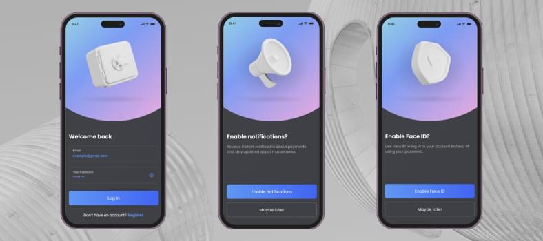
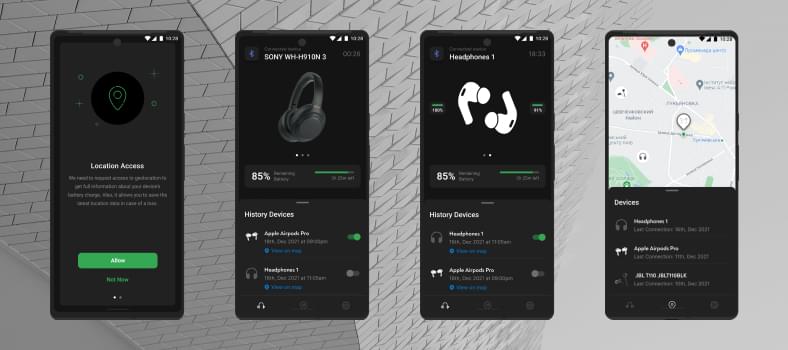
Consider your content first and strategically choose what is most essential. Your website visitors will see your header on both your mobile and desktop site, so ensure it instantly conveys your brand identity. For instance, your desktop version might include extra imagery for viewers. Still, with less space on a mobile website version, you’ll want to ensure the imagery you display best conveys your logo and product images. Check more on our Behance.
- Emphasize visual hierarchy
We advise considering website hierarchy when designing your website layout for mobile users. Carefully plot out your website content by adding headers and subheaders, optimizing navigation tools, creating image blocks, and utilizing white space.
With end users in mind, help them move on to your mobile site and meaningfully consume your content by adding clear CTAs and choosing the right menu. Many designers will opt for a hamburger menu to make the most out of the usable space on a mobile screen.
- Avoid or minimize in-app pop-ups
Pop-ups are one of the most essential communication and conversion elements. However, be reasonable when using pop-ups not to be annoying and not to distract your users from meaningful information on the website or from action.
- Create a user-friendly interface
Aside from content and visuals, ensure your mobile-first design is user-friendly. For example, mobile users have direct access to their cameras, touch screens, and autocomplete fields. It means you must attend to your website buttons, as a mobile site user will have a higher chance of clicking the wrong button.
- Test on real devices and under real conditions
And finally, before you publish, test your mobile site on real devices to understand how your user will experience your website. Try it on different screen sizes and devices to catch any variances between them. Check our case studies.
Final Words
Google’s documentation on mobile-first indexing best practices documentation states, “While it’s not required to have a mobile version of your pages to have your content included in Google’s search results, it is strongly recommended.”
Not only does Google very highly recommend it, but also your website visitors, especially repeat visitors, appreciate it. They might not be using mobile devices because of the poor User Experience. That’s why we recommend focusing not just on getting pages ranked high in search results, but also on ensuring that your website or mobile app visitor has a good experience on every page or screen.
Our UI/UX design team can help at any stage of your business growth. Starting with in-depth research, first sketches, full-fledged prototypes, or simply adding improvements to initial solutions.
About the author
Irina is a Creative Writer with 10+ years of experience within the software development domain. She is keen on everything tech and gets easily inspired, follows all the recent IT-related trends, and loves creating interesting content for the CHI Software blog, and social media.
Rate this article
24 ratings, average: 4.5 out of 5


